Company Culture
公司文化
2014年,正康取得ISO19001質量體系認證/ISO14000環(huán)境體系認證
2017年����,正康取得IATF16949汽車行業(yè)質量體系認證
2006-2018,在散熱產品的結構����、工藝、運用等方面已取得幾十項專利
Company Profile
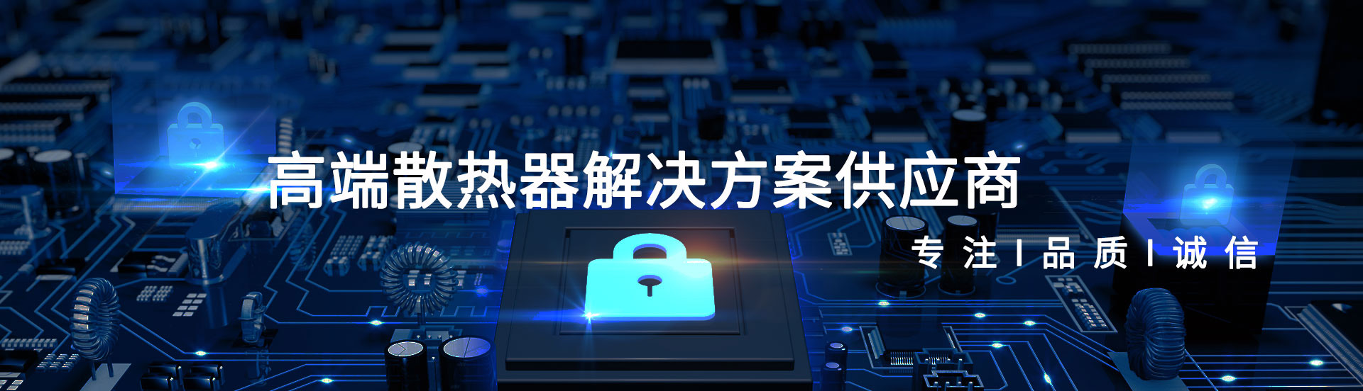
公司簡介
本公司成立于 2009 年��,是一家圍繞電子散熱體系���,集研發(fā)、生產、銷售為一體的高新技術企業(yè), 已通過ISO9001質量體系,ISO14000環(huán)境體系和汽車行業(yè)質量認證體系IATF16949.近十年的發(fā)展�����,正康可為客戶提供模組設計����,產品結構設計,熱仿真及產品加工等服務�。